


I like physical media. There’s something about having the information and artwork that comes with LPs and CDs that seems essential to me. I like to be able to refer to the personnel, engineer, and producer of the music to which I listen. I have digitized hundreds of LPs in my collection and generally listen to those digital copies for the convenience factor. That said, I would never get rid of the originals for the above reasons.
Streaming or downloading digital files doesn’t really appeal to me. Unless you are running software like Roon, which gives a lot of information but sounds too daunting (for me) to implement, you get the music, maybe the artwork, and nothing else. Having spent almost 30 years in the retail record business, I own just about everything I want to hear. For the most part, new popular music leaves me cold. So much of it relies on repetitive rhythms and that affront to singers everywhere, auto-tuned vocals.
(I’ll step down from my soapbox now and get to the point of this article.)
Fifty years ago (give or take a few decades), when vinyl was the primary medium for recorded music, a lot of attention was paid to the visual presentation of the product. Album covers were designed to pique the consumer’s interest through images and, in some cases, creative packaging. Unusual shapes and materials were occasionally utilized instead of the standard square cardboard jacket. Extra inserts (beyond the inner sleeve) often accompanied new releases. Nowadays, it seems that only boxed sets and reissues include such bonus material.
Before we explore some examples of creative packaging, I want to show you what I think is the most subversively creative album cover of all time – XTC’s Go 2.

 XTC, Go 2, front and back album covers.
This was created by the team at Hipgnosis (Aubrey Powell, Storm Thorgerson, George Hardie, and others), who were responsible for an incredible number of imaginative covers in the years before Photoshop. If your collection has a decent number of albums from the 1970s and 1980s, you probably have some of their work. Pink Floyd, Led Zeppelin, Genesis, Yes, Al Stewart, UFO, Montrose, and 10cc are just a few of the artists whose albums featured Hipgnosis-designed covers.
Die-Cut Covers
One of the ideas for making a standard square cover stand out from the pack was to die-cut the corners and/or sides to give it a different shape.
 Alice Cooper, Billion Dollar Babies album cover.
 Billion Dollar Babies inside cover.
Alice Cooper – Billion Dollar Babies
The original issue of this gatefold album cover was designed to look like a snakeskin wallet with rounded corners. But that wasn’t all that set it apart – inside was a folded “Billion Dollar“ bill that measured 22 inches by 11 inches and featured a photo of the band in place of a presidential portrait.
In addition, one panel of the opened-up jacket had ten wallet-sized photos of the band members. The pictures were perforated at the edges so fans could tear them out if they wanted. The inner sleeve had a photo of the band on one side and a full lyric sheet on the other.
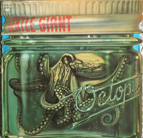 Gentle Giant, Octopus, US album cover.
Gentle Giant – Octopus (Domestic)
The import cover of this album featured a beautiful Roger Dean painting of a fierce-looking octopus. For the US release, Columbia Records chose an equally arresting illustration of an octopus preserved in a specimen jar. The cover was cut to mimic the contours of the jar and lid.

 Horslips, Happy to Meet…Sorry to Part, front and back album covers.
Horslips – Happy to Meet…Sorry to Part (Import)
This import LP from Irish folk rockers Horslips was cut in the octagonal shape of a squeezebox (accordion), and the filigree pattern of the ends was also elaborately cut. The cover folds open with three pages of band photos and info. The inside back panel lists the tracks.

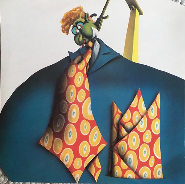 Monty Python, Matching Tie and Handkerchief, front cover and insert.
Monty Python – Matching Tie and Handkerchief (Import)
I can’t vouch for the domestic release of this LP, but the British edition was something special. Shaped to look like a gift box with a rectangular cutout showing the titular items (on an insert), it held two surprises. There was more to the tie and handkerchief illustration than what was seen through the cover. When you pulled the insert out, it revealed that the accessories were being worn by a man who was grotesquely, but comically, hanging from a gallows. The biggest surprise was on Side Two of the LP – it was cut with two interlaced spiral grooves, each with half of a side’s worth of different material. When you set the stylus down, you never knew which routines you would hear, and it was possible to hear the same stuff several times before finding the other bits.
 Todd Rundgren, A Wizard, A True Star album cover.
Todd Rundgren – A Wizard, A True Star
This wild album had a die-cut cover and numerous inserts. One item was a poem (by a pre-Horses Patti Smith) that was printed on the enlarged image of a Band-Aid. Another was a postcard that said if you mailed it back to Todd, he’d put your name on his next album. Of course I sent it in. Fun story: I was in college at the time, and because I had obtained a (mail-order) Universal Life Church ordination, I signed my papers “Rev. Richard N. Isaacs.” It was a great way to meet my instructors – the professor wanted to know who the minister was in the class. My then-girlfriend’s nickname was “Duck,” so I signed the postcard “Rev. Richard N. Isaacs & Duck.” When the next album, Todd, came out, the thousands of names were printed in alphabetical order, run together in very small type of varying shades of grey to form an image of Rundgren on a two foot by two-and-a-half-foot poster (see photo). When I found my name, it was followed by “Suzanne Isaacs” (no relation), making it read like “Rev. Richard N. Isaacs & Duck Suzanne Isaacs.” Somewhere in the world, there’s a Todd Rundgren fan wondering, “who the #@*! is this Reverend and how did I become Duck Suzanne Isaacs?”
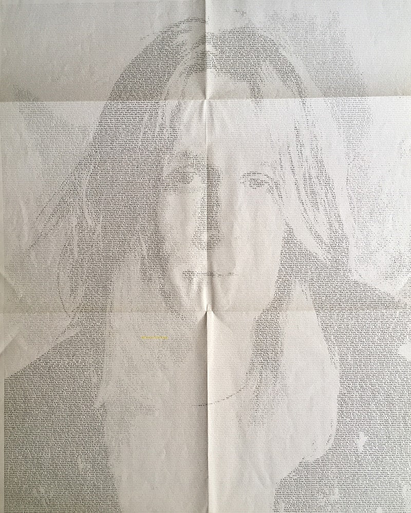 Poster insert for Todd album.
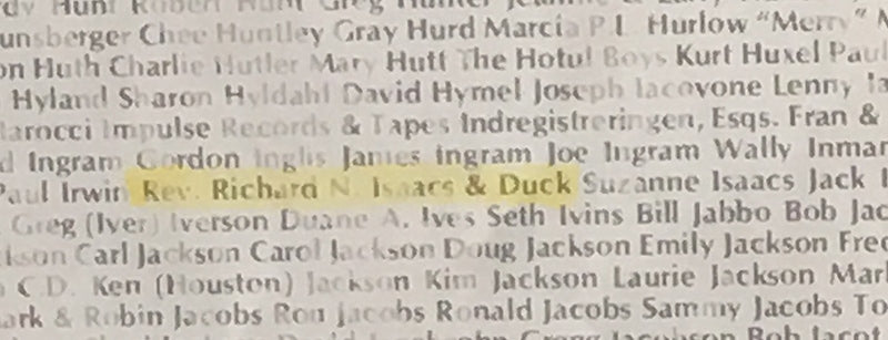 Immortalized!
 The Small Faces, Ogdens' Nut Gone Flake, front and back album covers.
The Small Faces – Ogdens’ Nut Gone Flake (Import)
This concept album cover was designed to look like a tobacco tin from British tobacconist Ogden, with the original “Nut Brown” designation changed to “Nut Gone.” The cover folded out into four circular panels, one of which was a photo of the contents of said tin. Some CD reissues came in an actual metal tin.

 Traffic, The low spark of high heeled boys, front and back album covers.
Traffic – The low spark of high heeled boys
This was cut at diagonally opposite corners (upper right and lower left) to give the impression of a cube. The copy shown is my Japanese pressing, which did not have cut corners – they printed it on a standard square with the “missing” corners in white. Traffic used the same die-cut profile for their next album, Shoot Out at the Fantasy Factory.
Embossed Covers
Another technique used to enhance the distinctiveness of album covers was embossing (having raised elements).
 Kevin Ayers, The Confessions of Dr. Dream and other stories album cover.
Kevin Ayers – The Confessions of Dr. Dream and other stories (Import)
This is a very elegant cover. Not only are the colored faces embossed; the entire jacket is laminated for a glossy look.

 Robert Calvert, Captain Lockheed and the Starfighters, front and back album covers.
Robert Calvert – Captain Lockheed and the Starfighters (Import)
This cover’s more subtle. The model jets on the wall are embossed, and the title is in silver foil letters. The back cover shows the models in pieces on the floor and each piece is also embossed.
This was a concept album about Germany’s ill-fated acquisition of Lockheed F-104 Starfighter military jets. The Germans had ordered modifications to the design to make it carry more of a payload, resulting in instability and numerous crashes.
Robert Calvert was a member of Hawkwind, and the record featured all the members of Hawkwind, along with Arthur Brown and Brian Peter George St. John Le Baptiste De La Salle (Eno). Vivian Stanshall (Bonzo Dog Band), Jim Capaldi (Traffic), and others contributed as actors for the spoken-word material.
 Kraftwerk, Ralf and Florian album cover.
Kraftwerk – Ralf and Florian (Import)
Kraftwerk’s third album was recorded and released just before the synth-rock pioneers hit it big with Autobahn. It was released in the US with a different (and less striking) cover. The UK edition featured embossed fluorescent pink lettering and golden circuit board traces, giving it a very classy look.

 Allsorts, front and back album covers.
Various Artists – Allsorts (Import)
In this instance, the embossing served a more utilitarian purpose. UK label Track Record printed many of their covers with Braille information on the back (and occasionally the front). The dots can be seen on the back cover photo.
In Part Two, we’ll take a look at other tricks that were used to catch the buyer’s attention, including 3-D artwork.
0 comments