
In this series so far, we have considered a few factors to inform our buying decisions when purchasing a new pair of loudspeakers.
We have looked at the importance of sound pressure level (SPL) and how it relates to your personal desired listening volume. We also examined the significance of a loudspeaker’s sensitivity rating and how this plays a part in determining what is suitable or adequate for the size of your room.
Other installments covered amplifier power considerations, and gave some tips on how to measure the output of loudspeakers with metrics that can aid in determining how loud they will actually play before they start to distort. One newer measurement resource, M-Noise, has been developed by audio company Meyer Sound. The use of the M-Noise test signal is provided at this link: https://m-noise.org/procedure/ Additionally, we looked at considerations of frequency response, and speaker size and room interactions.
As briefly noted in our last article (Issue 154), there is a type of speaker measurement that can be surprisingly insightful in indicating how a loudspeaker will actually perform in real-world scenarios, called Spinorama – and it’s not the typical set of measurements you’d see when looking at published loudspeaker specs.
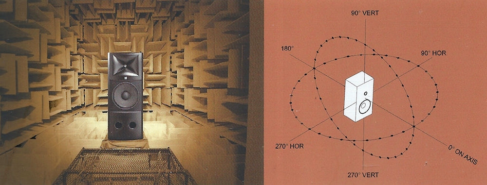
What is Spinorama? No, it’s not the deft defensive maneuver of a hockey player as they spin 360 degrees with the puck! The Spinorama we’re interested in is a set of data derived from measuring a speaker from multiple positions, with microphones measuring the speaker’s output through 360 degrees around the speaker. The measurements are done in an anechoic chamber. The resulting computer-processed Spinorama chart is based on measurements of the speaker’s frequency response at 70 different points, starting on axis, and then at each 10-degree angle around the speaker both horizontally and vertically. Reflections from the horizontal and vertical boundaries of rooms are the second-loudest sounds to reach listeners, having undergone only a single reflection. Sounds radiated at other angles travel farther and encounter several surfaces before reaching listeners and are therefore much attenuated, especially at high frequencies due to air absorption and the prevalence of high-frequency absorption in typical domestic rooms (carpet, curtains, seating and clothed listeners).
The point of this article (and an upcoming one) is to give some insight into understanding Spinorama information. It must be pointed out that Spinorama data isn’t as readily available for the majority of speakers as are the typical published loudspeaker metrics, but this situation is improving. There are many Harman products, for example, where Spinorama data may be found online. So, understanding Spinorama data can give you a better insight into how loudspeakers perform, and even indicate listeners’ loudspeaker preferences. It’s a fantastic, superbly powerful tool in making you feel more confident in your speaker buying decisions and critically, that what you end up with will provide an excellent listening experience.
Spinorama information was initially developed by Dr. Floyd Toole while at the National Research Council of Canada, then further pursued and refined at Harman International nearly thirty years ago. It has been adopted by the Consumer Technology Association (formerly the Consumer Electronics Association) and the American National Standards Institute (ANSI) as CEA 2034-A-2015 (ANSI), “Standard Method of Measurement for In-Home Loudspeakers.”
But just what do the wiggly lines on these charts mean, and why should I care about them?
I suppose the easiest conclusion one could make from looking at these charts is to determine that each of the six measurements are most advantageous to the listener if they are relatively flat (within their frequency response capability), and secondly, do not deviate very much from each other. But that, of course, is an oversimplification, if not a useful takeaway nugget. (This simplification excludes the Directivity Index plot which we discuss more in our following article.) Let’s take a more detailed look and see what is going on with an example of the Pioneer SP-BS22-LR bookshelf speakers. In this chart there are seven plotted sets of data, the gray one of which is the Predicted In-Room Response.
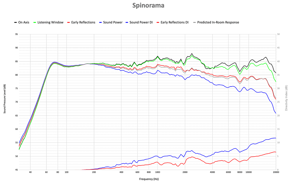 Spinorama plots for Pioneer SP-BS22-LR loudspeaker. Courtesy of Audio Science Review.
The graphs show the frequency being measured along the horizontal axis, and the measured SPL along the vertical axis. Looking at our plots, at the top we have in black the On-Axis Response; lime green displays the Listening Window, red shows Early Reflections and blue indicates Sound Power. At the bottom the Sound Power Directivity Index is in blue and the Early Reflections Directivity Index is in red. So, what is the significance of each and do they relate to each other?
Starting with our all-important On-Axis (or direct sound response), we are looking for as flat a signal as possible as this represents the direct sound from the speaker. Why? Because the direct sound forms a dominant part of the speaker’s personality and sound profile, and if it is measuring at a relatively flat response, tells you the signal being fed to the speaker isn’t being altered adversely. The flatter it is, the more integrity the speaker has in faithfully reproducing the source input signal and this is what we desire to see. This is subsequently influenced by the room.
The green plot represents the Listening Window, which includes the On-Axis response but importantly also the off-axis response of the speaker plus (above) and minus (below) 10 degrees in the vertical plane and plus and minus 30 degrees in the horizontal plane. What we want to see here is something that mirrors the On-Axis Response as much as possible, as this means a more consistent sound may be heard in more listening positions within the listening area. If there are large bumps or dips in this response, they may often be the result of resonances or off-axis issues where the speaker crossovers are not necessarily integrating between drivers as seamlessly as they could.
Next is the red Early Reflections plot, which comprises of the front-firing hemisphere of the speaker along with the first bounce reflections from 180 degrees horizontally behind the speaker (rear-wall reflections) and those of the room’s first reflections. Also included are the zero to 90 degrees off-axis responses in the horizontal plane, combined with the plus and minus 20 to plus and minus 40 degrees measurements in the vertical plane. In simple terms, this curve is the combination of reflected energy at the more extreme off-axis angles that would hit the walls (keep in mind that Spinorama measurements are done in an anechoic chamber). If these are “good” reflections, i.e., not demonstrating radical peaks and troughs which are indicative of unwanted resonances and ringing (see attached image), this curve will be very similar to that of the On-Axis Response and is highly indicative of a higher- versus-lower quality speaker response behavior. Good reflections (see image of the Pioneer speaker’s response) are ones which contribute to a smooth response which is similar to the On-Axis plot and make for a more similar listening experience over a wider listening area. It’s worth contemplating that logically, this Early Reflections response cannot be exactly the same as the On-Axis response, because it has to incorporate the off-axis reflections. This is where active speakers have the potential to really shine in their electronic management of the speaker’s response.
If both the On-Axis and Early Reflections curves were theoretically to be the same, the sound might seem unnatural to some listeners, lacking some degree of natural room delay. (On a side note, a lack of reflected sound is a reason why many people report a feeling of uneasiness when spending time in an anechoic chamber. It simply doesn’t “feel” natural.) Back to our Early Reflections response. Although we don’t expect it to be the same as the On-Axis response, we do want it to be close, allowing for some frequencies dropping off – usually the treble to some extent – and this may not be as significant as seeing treble rolloff on our next metric, Sound Power.
What about the Sound Power plot represented in blue? This indicates the total sound power output from the speaker, measured as it spreads out in all directions from the speaker as heard at the listening position. That is, the output from all 360 degrees, above and below, left and right, and front and back of the speaker. The treble roll-off represented in this plot shows that there will be much less treble at the sides and rear of the speaker (assuming it’s a typical forward-firing speaker design).
So, what do we actually want to see in the Sound Power graph? As with all the plots, we hope to see a smooth transition between any plotted points, because peaks and troughs reveal things like unwanted resonances, directivity problems or poor crossover implementation.
In the second part of this Spinorama discussion we will look more at the remaining information in the graph and how it too relates to speaker performance characteristics.
Header image: detail from the cover of Sound Reproduction: The Acoustics and Psychoacoustics of Loudspeakers and Rooms, Third Edition, by Dr. Floyd E. Toole.
